Billing Updates
Refining Instabot’s billing flow to be clearer and more visually engaging

Context
For Instabot to continue growing, existing customers have to maintain their subscription plan. One way to ensure that is for Instabot to have a clear and detailed “Billing” page readily accessible for the customers… which isn’t the case currently. The biggest challenge for this project was then to make the Billing page digestible, visually appealing, and valuable.
We followed a design-sprint approach to tackle this problem through continual research, iterating and prototyping of ideas, followed by implementing the solution. This approach was adopted to evaluate trade-offs and to mitigate risks.
My role was to research competitors, produce sketches of solutions that turned into wireframes and prototypes, iterate on designs based on feedback, and provide pixel-perfect deliverables for engineers to implement the solution.
Process
To better get an understanding of what I’m solving, I casually interviewed the sales and marketing team on feedback they heard from clients about the pros/cons of the billing page. The most common themes were:
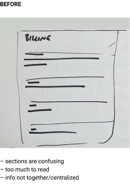
The Billing page has too much going on at once
I don’t know what my plan is and what I’m getting out of it
In other words, the user story that the team agreed on — “As a marketing manager, I want to clearly see in the Billing page what I’m signed up for, so that I can see if the service is worth my money or not.” To promote creative-thinking with constraints, I defined the problem state as: “How might we make the Billing page clearer at a glance for the users?”
“How might we make the Billing page clearer at a glance for the users?”
Once the various teams agreed on the problem statement, I identified the areas that need improvements and then went to work.
I sketched out possible solutions, narrowed it down to potential few, designed wireframes for the user flows, and produced a clickable prototype for evaluation.


The prototype passed my design criteria so then I tested it with my NY office to get more feedback. The proposed solution was largely positive, the minor tweaks were that I have to consider the in-between screens and change up some micro-copy. I made the necessary adjustments and then delivered it to the engineers for development.
Reflection
As a recap, Instabot needs to redesign the Billing page so that it’s visually engaging, clear, and valuable for clients to continue their subscription plan. To achieve this, I iterated and tested out solutions that led to a “compare and contrast” pattern that's highly visible and has immediate feedback.
Since the release of the new build, the support team reported that tickets regarding “Billing” dropped by 20% compared to last month, which clearly shows it’s more effective than previous design. The product team and I will continue to be in touch with the support team to see if trend continues in the upcoming months.
The lesson that I learned from this project was that Payment/Billing UI doesn’t have to be bland and dry — I need to look for opportunities to delight. And that I should bring more important information to the forefront and de-emphasize the less important ones